Tony Two Thumbs is a conceptual website for:
Manual therapy booking
Learning resources for pain management
Introducing Kontact: an app for Manual Therapists
Here is the link to Tony Two Thumbs prototype.
1. Project overview
The problem:
People seeking help for physical pain and would like to know how to manage pain better, either by seeking help from a manual therapist or self-help.
The goal:
A way to introduce Manual Therapy services, as a pain management resource blog and to introduce Kontact: an app for Manual Therapists.
My role:
UX designer, UX researcher from conception to finality.
Responsibilities:
Conducting interviews, paper and digital wireframing, low and high-fidelity prototyping, conducting usability studies, accounting for accessibility, iterating on designs and responsive design.
2. Understanding the User
User research: Summary
I conducted interviews and created empathy maps to understand the users I’m designing for and their needs. A primary user group identified was people who needed a way to learn about their pain conditions and how to treat them on their own or seek help.
As a trained manual therapist, I felt there is a need to share and educate clients to understand their bodies, the importance of self-care for performance, and how they can reach me if they need help.
User research: pain points
Clients who self-analyze: Clients with chronic conditions who self-analyze incorrectly and insist they are correct
Clients who expects a quick fix: Clients who have tolerated years-old injuries expecting a fix in one session
Unable to ascertain causes of pain: Challenge to pinpoint recurring pain and discomfort
A user persona was created based on an existing client. The user journey map was then created to understand how they behave to get information they need and to make a booking on a website.
3. Starting the design
Sitemap
The initial idea was to incorporate an introduction of Kontact, pain management information and differentiating between the treatment modalities of treatment offered. The sitemap was conceived to be as simple as possible to navigate.

Paper Wireframes
Next, I sketched out paper wireframes for each screen in the mobile version of the webpage, with different layouts for quick “eye to content” in mind.

Paper wireframe screen size variation
Based on progressive enhancement, I decided to go with a layout that will showcase the Kontact app, resources and services distinctly.
I have written notes on the side for the content to be included.

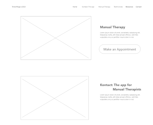
Digital Wireframes
Moving into digital wireframes, it gave me an opportunity to see how the features and elements I thought about came together.
Low-fidelity prototypes
In the low-fidelity prototype, I connected all of the screens to make the flow of information as intuitive as possible.
At this point, I received feedback on my designs about things like placement of buttons and page organization. I listened to their feedback, and implemented several suggestions in places that addressed the user pain points.
Usability studies
A unmoderated usability study was done with 5 participants. The insights gained were:
Real testimonials: Users want to be able to authenticate if testimonials are reliable, usually via their social media accounts
Resources: Will be helpful if more in-depth information is available. Will consider developing a resource blog in future.
Looks stark: Made changes to the background to improve visual guidance towards content.
Digital Wireframe screen size variations
I decided to have the same content layout for both desktop and mobile versions.
Users who switch between modalities are are able to seek information based on familiarity of the layout.


4. Refining the design
Mock-ups
Added social media handles of testimonials for authenticity. Users are able to contact them to authenticate their experience with Tony Two Thumbs.


Before usability study
After usability study
I also added a color gradient to the background to reduce the starkness of the page. It guides the reading from the darker to lighter gradient, hoping to encourage the user to complete reading some of the lengthier content.

Before usability study
After usability study
Desktop Mockups: Original screen size
Visual hierarchy was established with fonts for within the sections. I also attempted to maintain a fairly consistent layout across the pages.

Mockups: Screen size variations
I included considerations for additional screen sizes in my mockups based on my earlier wireframes.
With users using different devices, I thought it would be beneficial for them if they could browse using various tablets or mobile devices.

High-fidelity prototype
The hi-fi prototype uses the same user flow as the lo-fi prototype, and I’ve included the design changes made after the usability study, and several changes suggested in the study.
Here is the link for the site’s high-fi prototype.

Accessibility considerations
Different sized text for emphasis and to establish visual hierarchy.
Used consistent navigation on each page. Makes it predictable to navigate from any point on the website on both desktop and mobile versions.
Linear and consistent layouts on both desktop and mobile versions. Regardless of modality, users will be able to seek the information predictably.
5. Going forward
Takeaways
Impact:
Users shared that the design was easy and natural to navigate. The appropriate accompanying images made it easy to locate information at a glance. The content layout also demonstrated a clear visual hierarchy.
What I learned:
The most important takeaway for me is it is possible to cater to a specific audience with different needs, in this case clients who wish to seek treatment and those who need information. Directing specific user flow and keeping the flow consistent across different devices will improve the experience greatly.
Next steps
To conduct follow-up usability testing on the new website.
Add in a client scheduling management function.
Identify any additional areas of need with regards to client education and ideate on new features